Upland Project | Kitchen
I’m so excited to be sharing the before & after’s of the Upland Project Kitchen today! We started with their Family Room and are slowly making over the rest of the rooms in their house. Their style is eclectic and transitional, and my goal has been to marry the traditional bones of their home with their love of luxe and rustic touches. Here’s a look at what I designed for their family room - you can see more photos from that project right here.
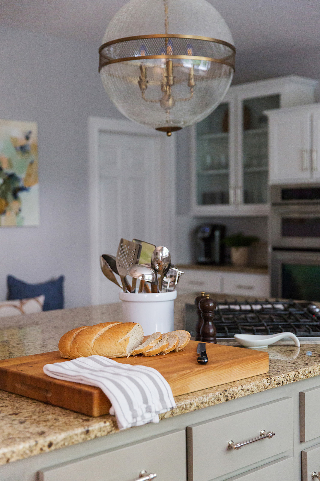
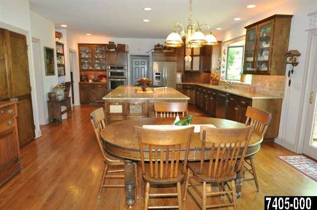
As soon as we finished the family room, I was looking forward to designing the kitchen. These are two of the hardest working rooms in their home and they are right next to each other; adjoined by a large cased opening. A little disclaimer about before photos - I pulled them from the old listing photos so they aren’t the best quality. I need to be better at remembering to take good before photos! The old kitchen was very country feeling, with wood cabinetry, granite countertops and beige tile backsplash. But, the quality and bones of the kitchen were great! So instead of tearing everything out and starting from scratch, we refreshed the design of the kitchen while keeping the existing cabinetry and countertops. This makeover is a true testament to the power of paint!
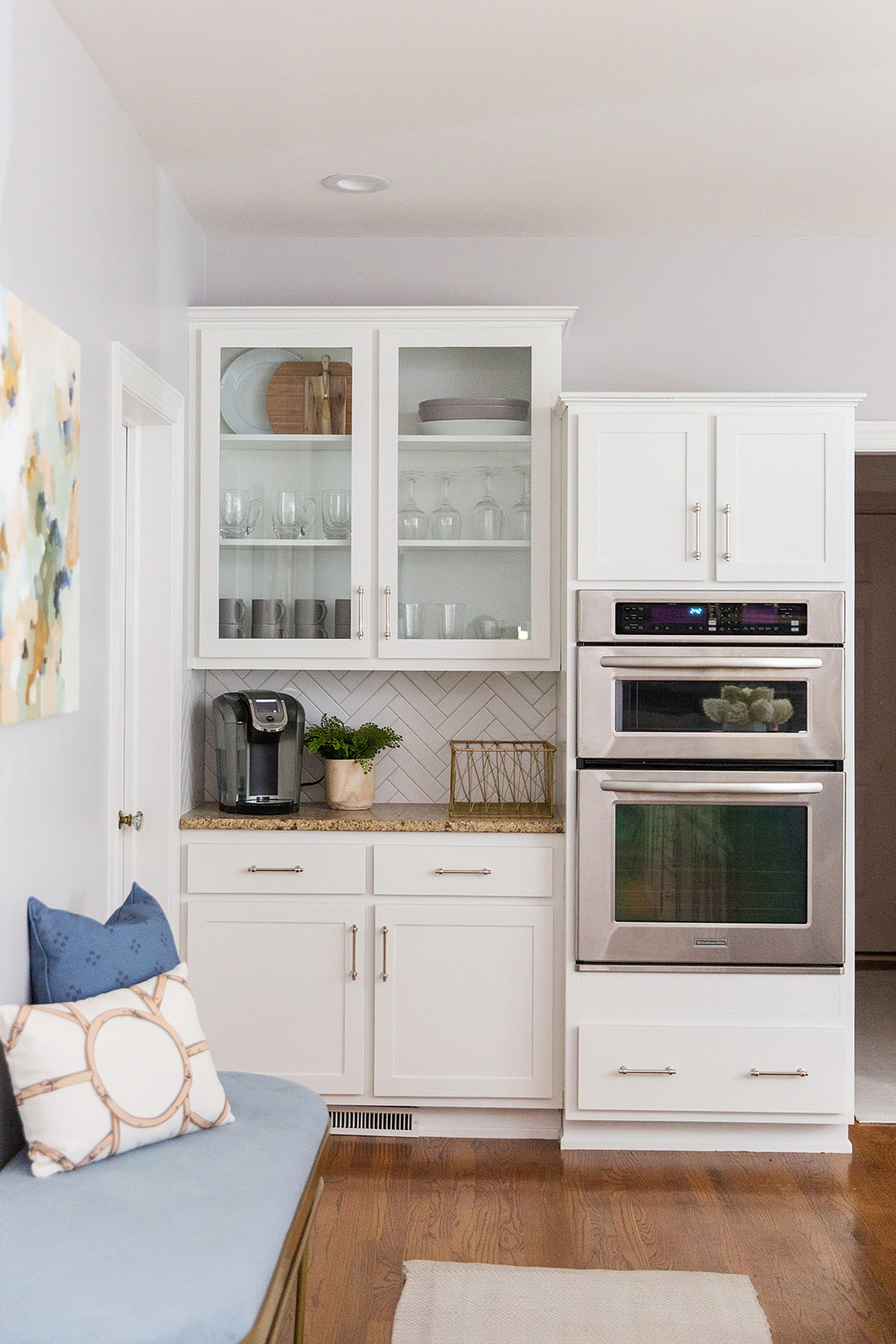
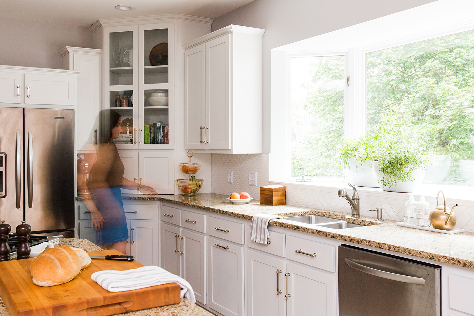
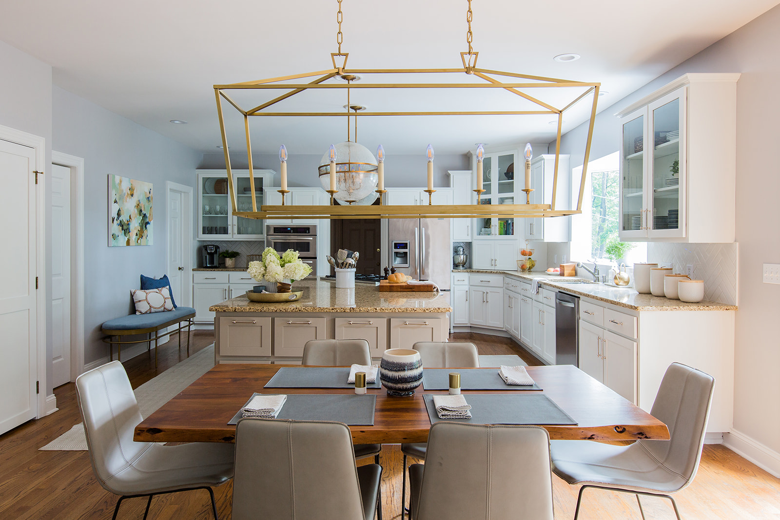
Isn’t it crazy how different it looks? Here’s a run down of what we did to take this kitchen from very brown “before” to fresh and bright “after”.
Removed built-in desk and shelves and filled in niche with drywall
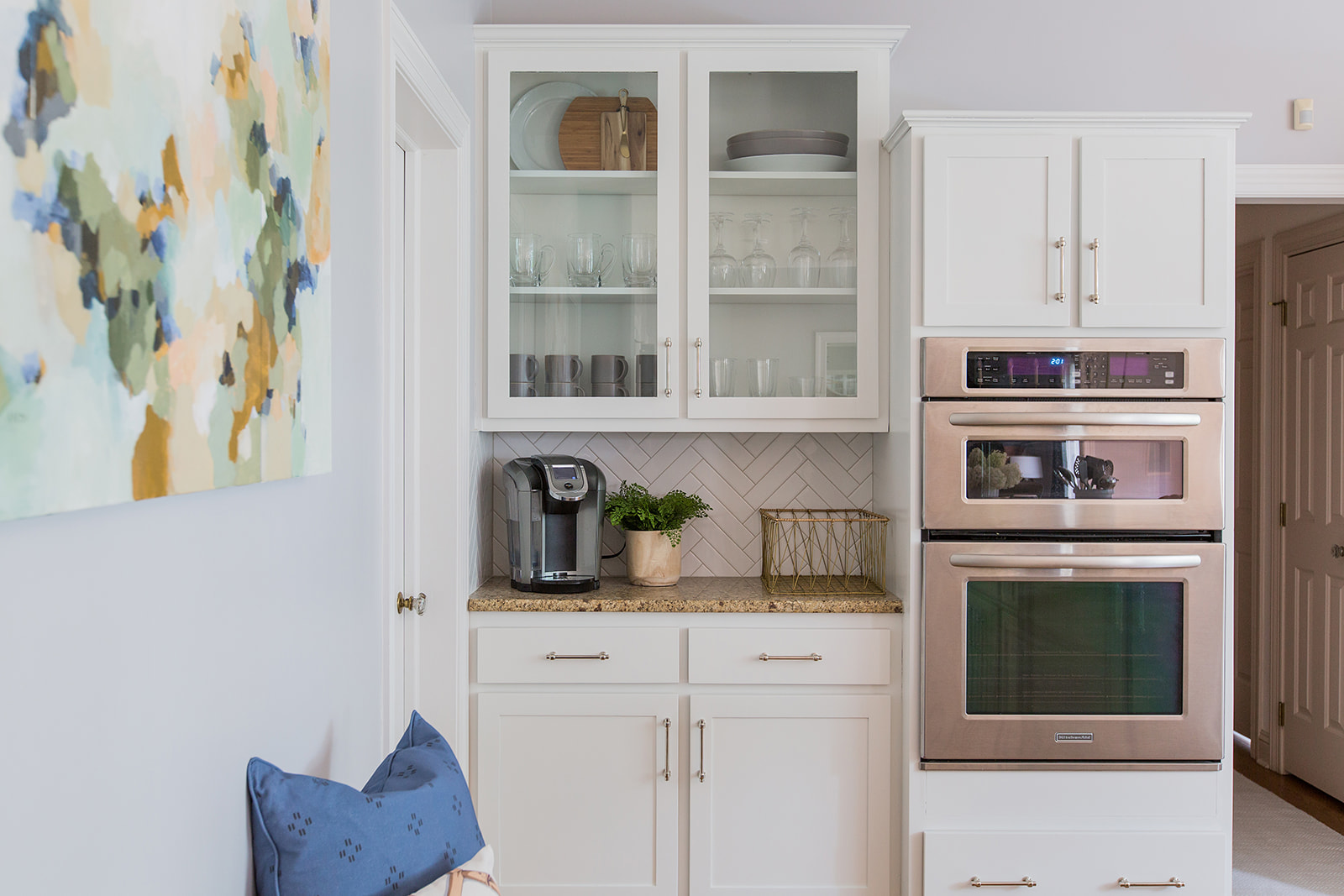
Painted walls, trim, doors and cabinetry
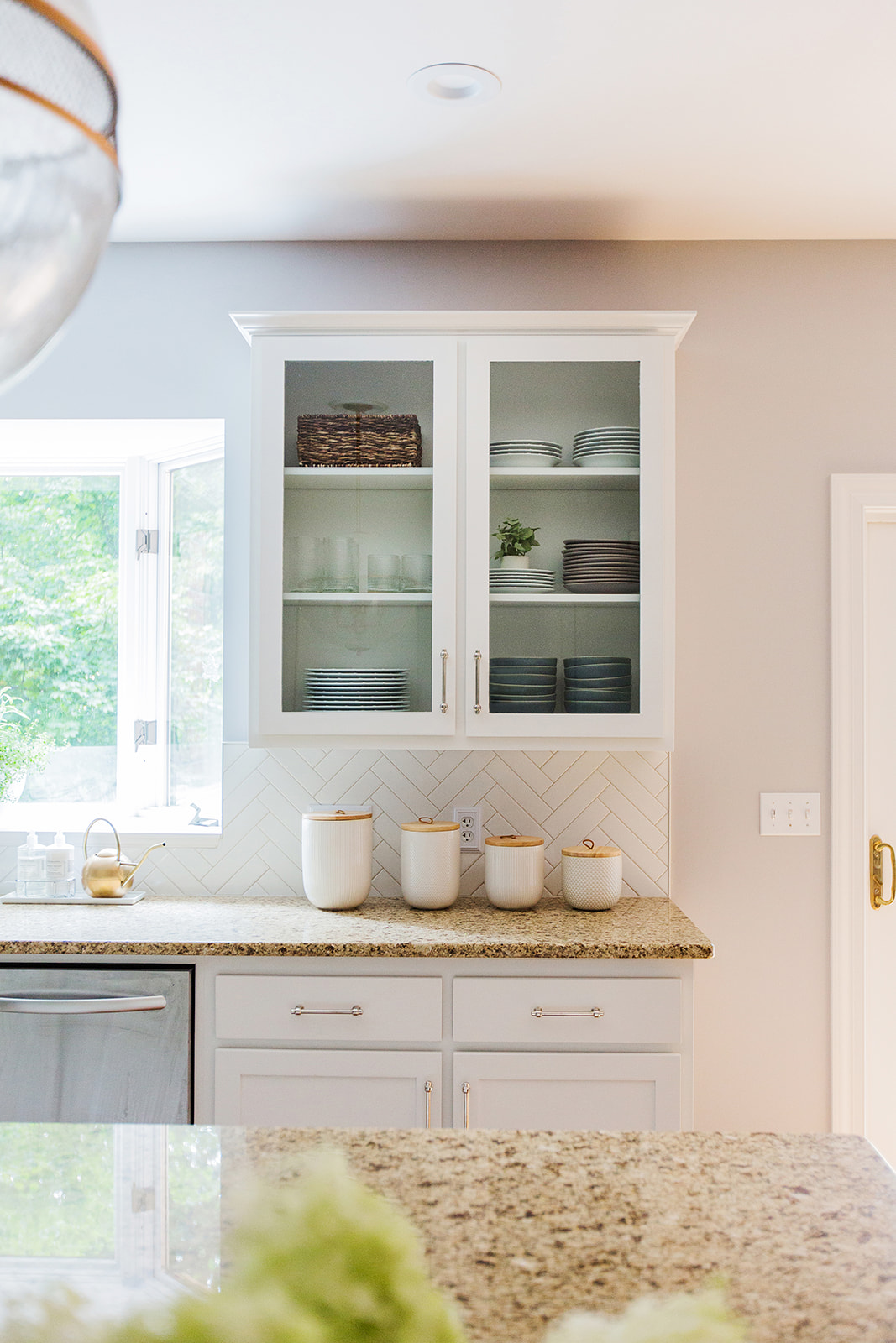
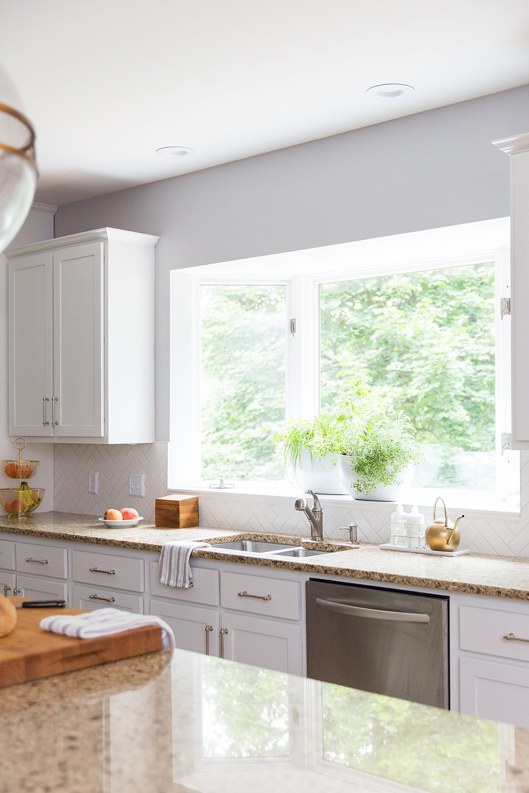
Installed tile backsplash in herringbone pattern
Replaced light fixtures and cabinet hardware
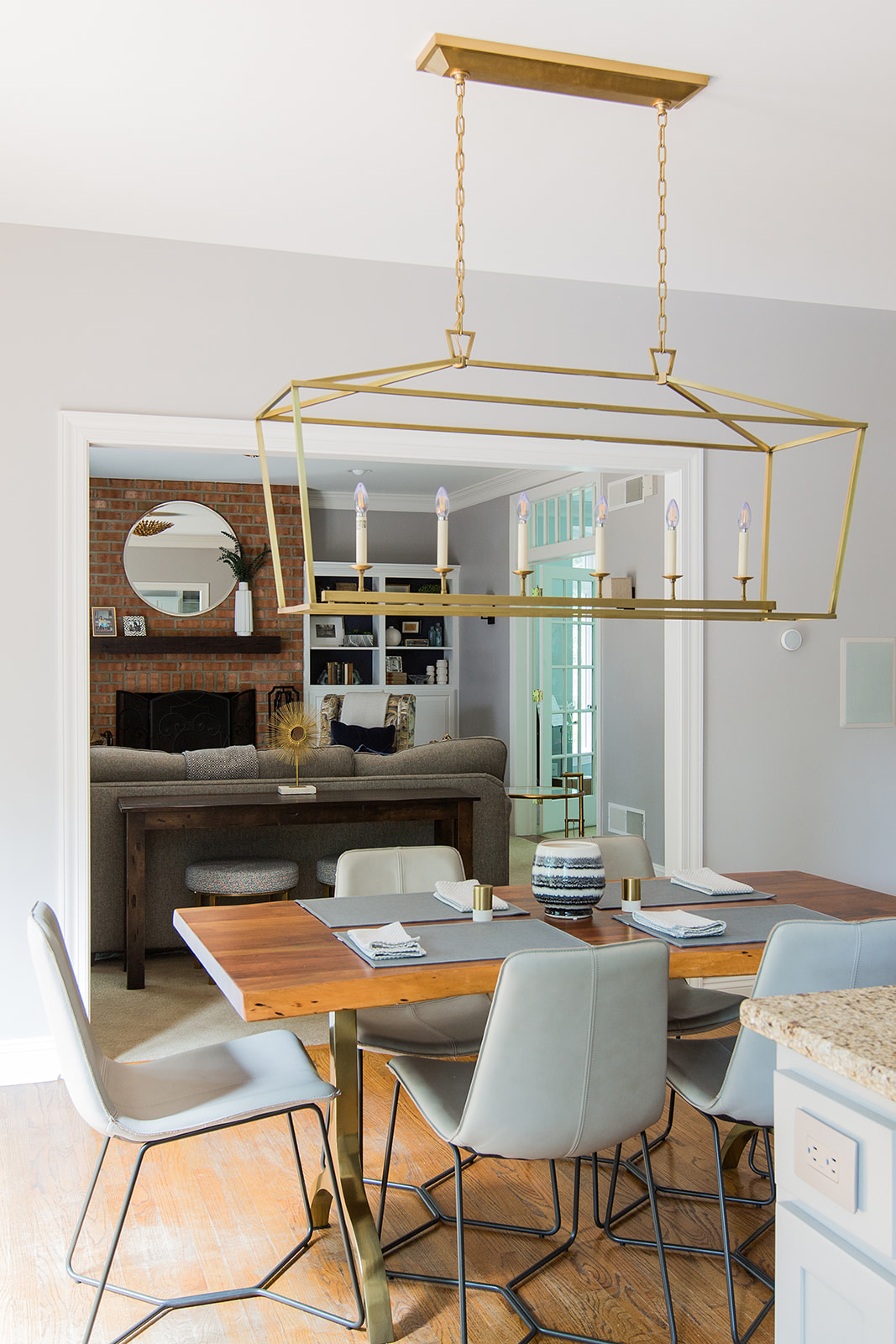
New dining table, chairs and bench
All new kitchenware, accessories and decor
Commissioned artwork from local artist, Andi Ann Studio
Planted windowsill herb garden
I love the way these two adjoining rooms complement each other now! To keep the color scheme cohesive, I selected a paint color that was on the same chip as the color they had chosen for the living room, but a few shades lighter. For the cabinetry, we did white on the perimeter and I pulled a taupe shade from their granite countertops to paint the island. Their kitchen is on the larger side and I think a little contrast with the cabinet colors really works! I wanted the new backsplash to feel light and bright, so we chose a simple white subway tile installed in a herringbone pattern with warm gray grout for some subtle contrast. Instead of matching up all the metal finishes, we mixed polished nickel hardware with brass light fixtures and accents for a more eclectic look. Warm wood tones like the new dining table and cutting board keep this mostly white kitchen from feeling sterile. And as always, you can never have too much greenery! I styled the island with a bouquet of hydrangeas from my garden, planted two large containers with herbs for their generously sized window sill and used realistic faux plants on shelves and by their coffeemaker where there wasn’t enough sunlight for live plants to thrive.
images by Abigail Rose Photography
This project was a dream come true to work on! You can learn more about my interior design services, here.

