The Cabin: Making the Best Use of Limited Square Footage
Last week, I told you about my parents' cabin by the river and showed you pictures of what it looked like when they bought it. If you haven't seen it yet, click here to see last week's post! It's definitely a fixer upper.
And that fixing is starting with the floor plan.
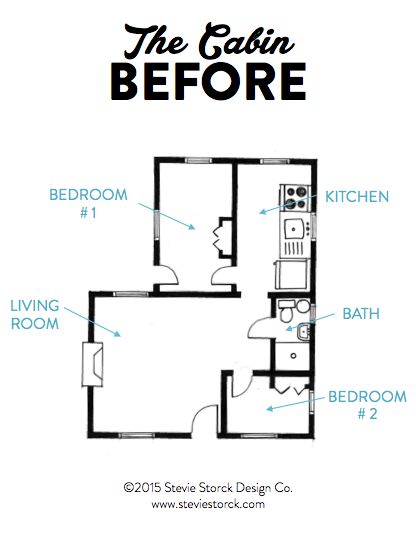
The cabin tops out at a whopping 640 square feet. There were plenty of things wrong with the way the cabin's floor plan was laid out. For example, while it did have two rooms with their own doors and closets, it was only listed as a 1 bedroom. I'm guessing because the smaller bedroom was just too small to fit anything bigger than a crib or toddler bed into, they didn't count it.
It was listed as a 1 bathroom though, which was not entirely true. It was actually a 3/4 bathroom (a bathroom with just a shower). The bathroom was probably only 30-32" in width, just enough to fit the smallest stand-up shower I'd ever seen. Plus, the cabin has no basement so the bathroom also housed the hot water heater. With the way the fixtures were laid out, if you sat on the toilet your feet would practically be in the shower and your thigh would be touching the hot water heater. There were many more problems, which I have outlined for you on this snazzy little diagram.
Now, we could have solved all these problems pretty easily but just ripping off the back of the house and expanding it with a 20-foot addition. But what's the fun in that? Budget-wise, it made much more sense to work with the square footage that we already had. It was up to me to come up with a plan for how to maximize the existing footprint.
To me, the biggest problem was that the rooms were divided in such a way that there was no separation between private and public zones. In interior design, we talk about public zones as being spaces used for gathering and entertaining (like kitchens, living rooms, dining rooms, etc.) and private zones being bedrooms and bathrooms. Rule number 1: It's not comfortable to use a bathroom that is only four feet away from the living room. Especially when said bathroom has paper-thin walls that don't even go up the the ceiling. I knew I could come up with a way to better divide the space into the proper zones, while also increasing the functionality and usability of the limited square footage.
The change that made the biggest difference (and took the most convincing!) was eliminating the second bedroom. There was no way to fit two functionally sized bedrooms with enough storage space into the existing footprint. I would much rather have one nice bedroom than two that are too small to even fit a dresser into. And because the property was already classified as a one bedroom, we weren't losing anything from a value standpoint. By eliminating the second bedroom, I was able to create a floor plan that maximized the square footage with a new open concept kitchen, dining and living space, a full bathroom (with a bathtub!), a space for laundry and a nice sized master bedroom.
In case you are wondering where the hot water heater went, it was relocated to just outside of the house in a newly built (and insulated) utility shed. To give you some context, here's an image of the old floor plan overlaid onto the new plan. (Old floor plan is in blue).
What do you think of the new layout? Could you imagine yourself living in a tiny house like this? Share your thoughts in the comments section below!
Disclaimer: These drawings are quick conceptual sketches, not scaled architectural drawings. These drawings are simply meant to illustrate the existing conditions and space planning solutions that I created for this project. These drawings were also done from memory, so not all details are 100% correct when you compare them with the photos I found for last week's post.


