DIY Vintage-Inspired Typography Poster
Photo by Savannah Smith Photography
I've been lusting after large scale vintage typography posters for a while now. The real deal can be pretty pricey and while there are a lot of vintage-inspired posters available on sites like Etsy and Art.com but I wanted something that was a little more meaningful and unique for our first home. So I had the idea to create a simple, minimalist design that highlights all of the little things that make our family special. Places we love to go, things we love to do, and dreams that we are dreaming together.
Of all the DIYs I've done for our new home so far, this one is probably my favorite!
If you want to make your own personalized family art poster, you're in luck! This was a super simple and inexpensive project to DIY. You don't need any fancy graphic design software to make your own art prints. I designed this using Microsoft PowerPoint and had it printed at my local Staples for about $2. The frame, I purchased from Target for I think about $15 and then painted it gold with some extra spray paint I had on hand. So for under $20, I have a large scale, custom piece of art to display in my home!
Here's how I did it:
Open a new slideshow using Microsoft PowerPoint. Note: My computer is 5 years old, so I have Version 14.0 of PowerPoint. If your computer is newer than that, your screen might look a little different but you should still have the same actions and tools available.
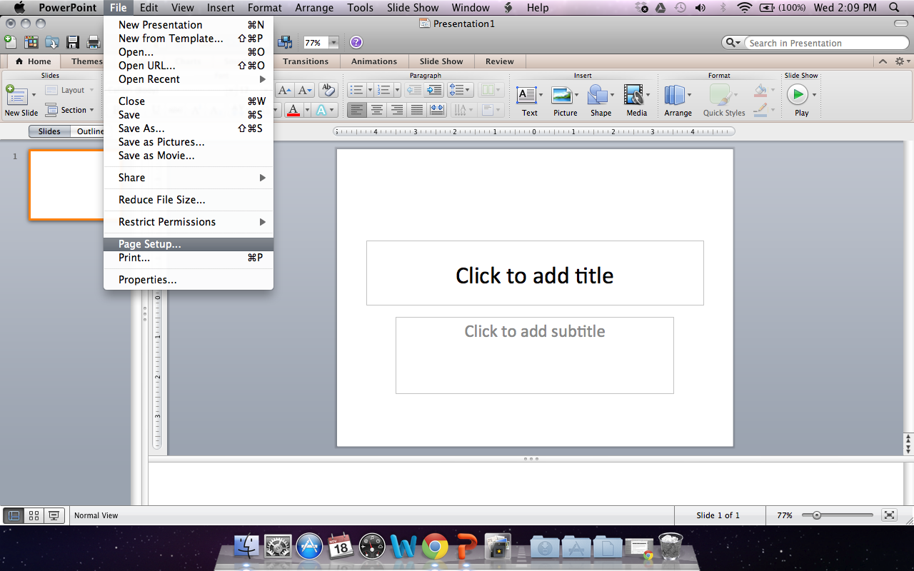
Next, you want to go to File > Page Setup...
Once the Page Setup window is open, you want to manually changed the Width and Height fields to the desired dimensions of your art poster. I chose to make mine 18" wide x 24" tall.
Once you hit "OK" a little screen will pop up saying that this is way too big for your printer and that you need to fix this before continuing. Ignore this and continue by hitting "OK" again.
After hitting "OK", your slide size should automatically change to the new, larger dimensions and your screen should look like this (see below). You could start typing into either of the text boxes that automatically populate your slide, but I find that it's easiest to just delete them and start over. The pre-made text boxes have all kinds of formatting that you're just going to have to undo later. So highlight these two boxes with your cursor and hit delete to start with a blank slate.
To add a new text box, go to the Home Toolbar > Text and click Text Box. Then put your cursor in the top left corner of your slide and drag to the right. It doesn't matter how big you make the text box now, you can always change it later.
Type in the first sentence of your poster as a placeholder. Once you have some text, you will be able to format the size and position of the text box and change the font style and size.
I wanted a vintage look, and a bold, graphic font that would be easy to read from far away. I chose Fette Bauersche Antique UNX Pro by Peter Wiegel. This font is available as a free download on Dafont.com. Click here for free download.
Once you have changed the font, continue typing each line of your art poster. Once you have written all the lines, play around with the font size and position of your text box until you are happy with the look. I ended up sizing my text to 60pt, left justifying the text box and positioning it slightly off center with large margins to accommodate a frame.
When you are happy with your design, go to File > Save As... and save your design as a PDF File. Make sure you've also saved your PowerPoint slideshow, just in case you need to go back and change anything later!
Next, you will want to take your file to a local printshop like Staples or Kinko's and request a 18" x 24", black and white engineering print. Like I mentioned before, mine only cost about $2 to have printed. It came out great!
The only thing I wish I would have done differently would have been to request that they DO NOT roll the poster up for me to take with. No matter what they tell you, the creases from rolling it never come the whole way out. You can't tell from the photos, but in person I can still see the bubbling. I wish I would have brought the frame along so I could pop it in and transport it completely flat and protected. Since it was so cheap, I may still have another print made just so I can do this and eliminate the bubbling. I made this the week before our housewarming party, so at that point I just wanted to get it up on the wall!


