My Top 5 Favorite Reveals | ORC Spring 2016 Featured Designers
This was my first time really following and participating in the One Room Challenge, hosted by Linda from Calling It Home. Even though I didn't finish my room by "Reveal Day", I've had so much fun following the Featured Designers projects and connecting with other participating bloggers through Instagram. There are so many amazing makeovers that came from this spring's challenge. Today, I'm sharing my top five favorites out of the 20 Featured Designers. Starting with...
There are a several reason's why Kevin from Thou Swell's makeover is one of my favorites. First off, his design for this Master bedroom (his father's) is just so FRESH looking to me. Sure, he's borrowed from some classics and trends, but the way he put everything together feels very unique to his style. I am in love with the white walls + high gloss navy ceiling combo! If you follow me on Instagram, you may remember I've been sampling shades of green/teal to do this same look for our guest bedroom. It looks so amazing in this room that I want to do it this weekend! (Chill Stevie, you still have YOUR One Room Challenge project to finish...) I actually had never heard of Kevin's blog before the challenge, but now I know he is one to watch! My mind was completely blown when I found out that he's a high school senior. Kevin has a bright future ahead of him, I'm sure of it!
4. Making It Lovely
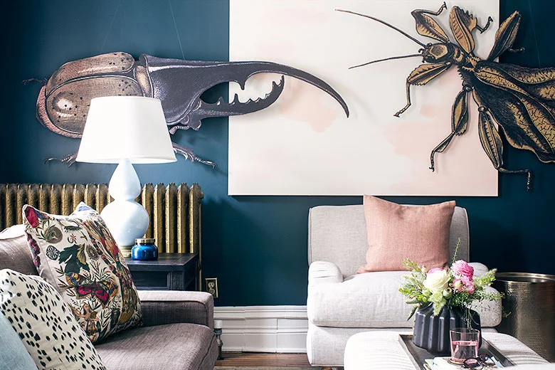
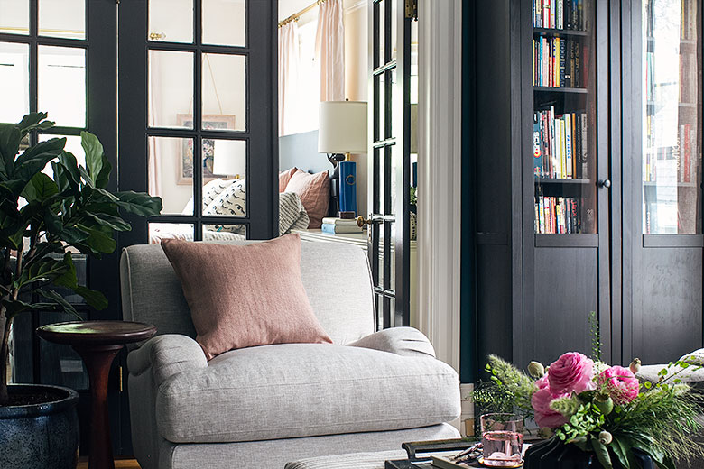
Nicole of Making It Lovely gifted us with a double whammy, making over not only her master bedroom but also the adjoining den. I really like what she did with her bedroom, but I LOVE the way her den turned out. First off, her paint color scheme is just fantastic. Pale blush in the bedroom, a teal-navy in the den with white trim and black doors throughout? Yes, please. The thing that really takes her design over the edge for me is the DIY Insect Artwork she made! Seriously, who would think that blowing up illustrations to 6 feet long and mounting them on foam core would make such an elegant statement? I'm a sucker for rooms with a little quirk and designs that don't take themselves to seriously. ALL THE GOLD STARS TO YOU, NICOLE!!
3. Sketch42
Nicole from Sketch42's makeover is just WOW. Never in a million years would/could I have put this combination together, but now that I see it, I'm obsessed! Nicole made over her younger sister's room at their parent's home, but the one stipulation her mother gave was that they could not paint over the bubblegum pink walls. Nicole ran with it, giving this formerly sweet room a salty edge with black accents and modern details that are anything but precious. Nicole created an awesome, floor to cieling gallery wall using her own art and photography. If you look in the bottom right corner of the photo above, you can see that she included a photograph of pink doors that are actually on the other side of the room. Again, interior design with a sense of humor! I'm all for it! This room screams COOL GIRL. The minute I saw it, I thought of my rockstar, social media wiz kid little sister. Maybe because she's really cool and has bright pink hair?
2. Design Manifest
Naomi from Design Manifest's kitchen remodel is full of all the things I love. Neutrals, classic yet modern and minimal design...but she really sets this kitchen ablaze with the colorful accents of coral-orange on her bar stools and in the custom roman shade. Which is a genius idea, because if she ever wants to switch up the accent color, these are two easy things to change! This room just makes my eyes happy. It's Naomi and her father Andrew run a design-build firm in Philadelphia, just a couple of hours away from us. Definitely adding her blog to my follow list!
1. Claire Brody
And my number one favorite makeover has to be Claire Brody's. If you've been reading my blog for a while, you know this isn't the first time I've mentioned Claire's work. I am such a fan of her unique, collected style and her blog is one of my favorites to read. For the One Room Challenge, she tackled her parent's formal living room. This is one where you MUST see the before. It was pretty, but super traditional and a little dated looking. With gallons and gallons of white paint and a clever mix of antique and mid-century furniture, Claire created a room that dramatic, refined, neutral and bold. Every time I look at her photos, I notice new details. You killed the ORC, Claire!
What are your favorite reveals from the One Room Challenge?
See the other 15 featured designer's makeovers here:
Claire Brody | The Curated House | Design Manifest | Driven by Decor | Honey We’re Home | Hunted Interior | The Makerista | Making it Lovely | My Sweet Savannah | Pencil and Paper Co. | The Pink Clutch | Savvy Home | Simplified Bee | Sketch 42 | Jill Sorensen | Orlando Soria | Thou Swell | The Vault Files | Waiting on Martha | The Zhush
Media Partner House Beautiful | TM by CIH


