Master Bedroom Inspiration | Moody, Masculine & Vintage
Yesterday began the first step of our Master bedroom redesign. Our new king size mattress was delivered! To keep it simple, we had it set up in the front bedroom so we would have it out of the way when we start painting in a week or two. You can see our temporary sleeping quarters in yesterday's post, here. Our goal for this weekend is to remove the random sink the Master and prep for painting. This month, we will also be ordering our new bed frame, which I am super in love with and can't wait to show you!
Here's a reminder of what we are working with:

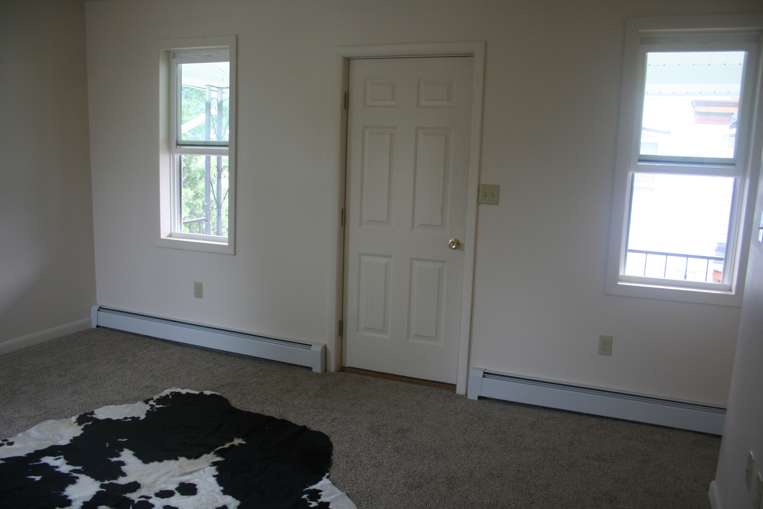

I already had a vintage, masculine vibe in mind for this room, but when I found this oil painting at a consignment shop in Kennet Square (with Haley!), it really solidified everything for me. Someone told me it looks like an old art school project. I love everything about it.

I'm still waffling on how I want to address the off center window on the wall I'm planning to put the bed on. I've considered about 7 different options, but if you asked me today I would probably choose my first idea, which is some variation on this look:
Sarah Gibson via A Beautiful Mess
On Monday, I met Jamie during her lunch break to peruse the discount room of the wallpaper manufacturer she works for. (If you live in York, you know which one!) We found this awesome/kooky/vintage/cool scenic design by Ronald Redding. It has a navy background and all these funny little characters. I'm planning to use it in both of our closets for a fun accent.
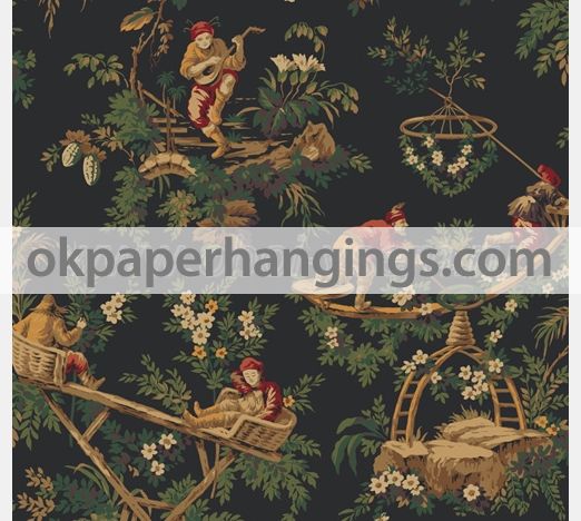
While our house was built in 1903, just about all of the original details were stripped between it being renovated as a duplex (and back again) and a fire in 2011. One of our big goals is too add some character back into our old farmhouse, so I like that this wallpaper looks like something that might have already been there, that we decided to keep for fun in just the closets.
Speaking of the closets, another thing I plan to upgrade is the doors. I HATE sliding doors for closets. In theory, these space saving solutions make a lot of sense, but in practice you can only access one half of your closet at a time. Dislike. I'm thinking buying some cheap bi-fold doors and making them look more expensive with moulding and some fancy hardware. I would love to do some kind of chunky, brass ring pull.
That's all for now! Hopefully I'll have some nice progress photos to show you in a couple of weeks!
Are you starting a new project? What's at the top of your to-do list?
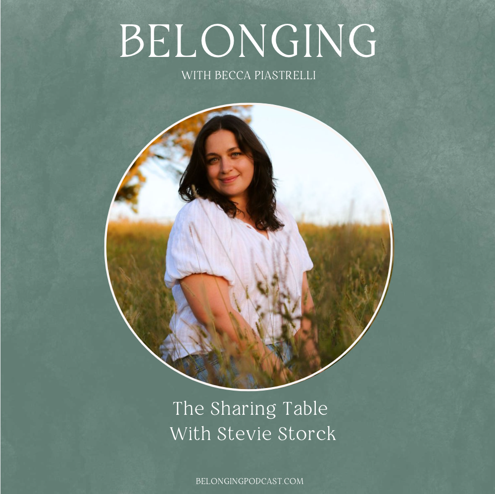
Exciting news: I was interviewed for a podcast! And not just any podcast, but Becca Piastrelli’s podcast, Belonging. Becca’s work has been an inspiration to me for many years, and it would mean so much if you’d give our conversation on the Sharing Table a listen!
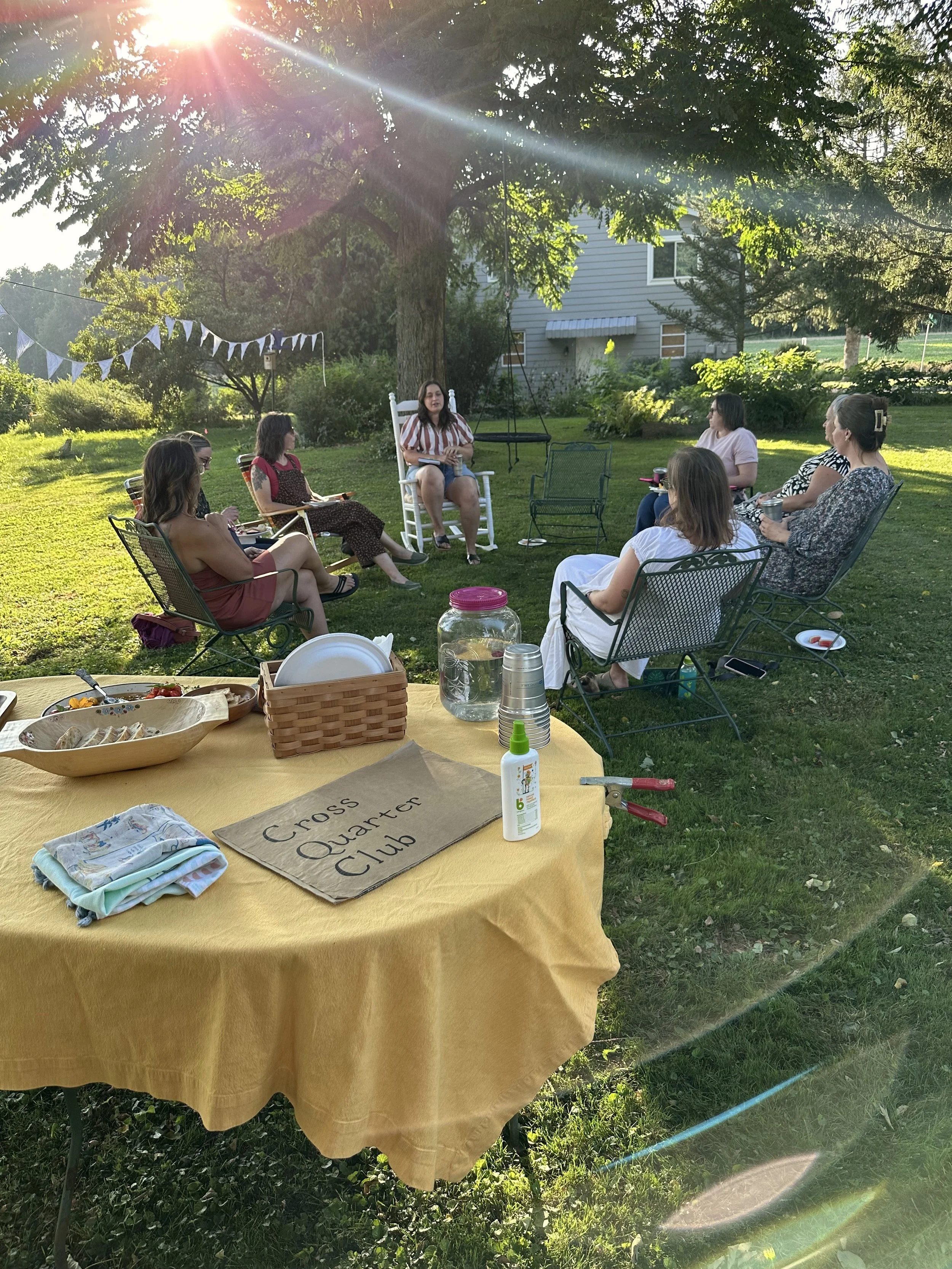
Our third Midseason Gathering of 2024 was held on Sunday, August 4th at the pavilion at Yoe Park in Yoe Borough, Pennsylvania. This season, we tried something new and hosted a Club Social in addition to our summer Sharing Table tradition of a Garden Bounty Share. Read on for a complete recap!
Our second Midseason Gathering of 2024 was held on Sunday, May 5th at the pavilion at Yoe Park in Yoe Borough, Pennsylvania. Our workshop this season was was a plant walk and spring tonic oxymels led by Calyx Liddick from Northern Appalachia School of Herbalism. As always, we enjoyed a spread of seasonal snacks and drinks and our cherished Sharing Table tradition. Read on for a complete recap!
What could be more relaxing on a Friday evening than a sunset stroll around a beautiful garden, yummy snacks, herbal tea, and good conversation around a firepit? Nothing! And that’s why you should come to Cross Quarter Club’s Garden Walks at Little Farm Flowers East this year.
Looking for where to buy plants in York, PA? Here’s a list of my favorite independent, locally-owned, family run greenhouses and plant nurseries so you can support small business and your gardening hobby at the same time!
In my opinion, no party is complete without a little background music. Whether it’s a simple dinner with friends, the holidays, or any kind of celebratory gathering, the right playlist can set the tone and add a thoughtful touch. I’ve gotten a few questions and comments about the music I play at Cross Quarter Club’s Midseason Gathers, so I decided to share my playlists here!
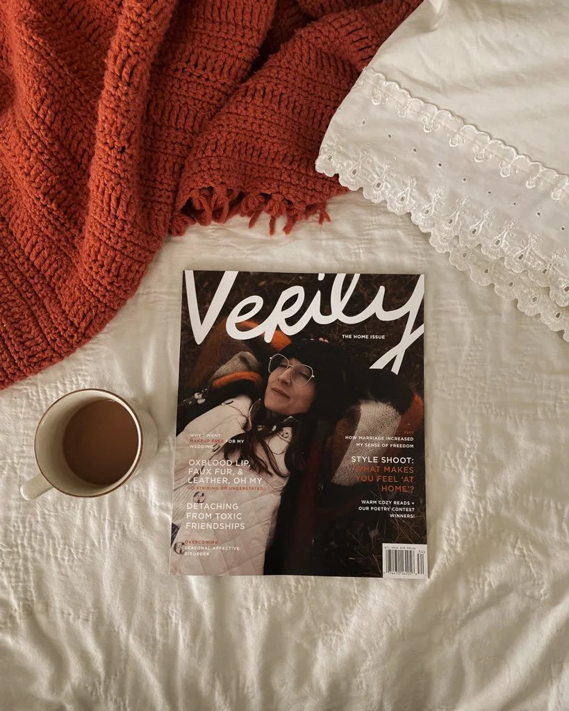
My article, The Joy of Slow Decorating, was published in the Winter 2023-2024 issue of Verily Magazine. It was an honor to be commissioned to write about a topic so close to my heart. I feel it is my best piece of writing on the subject of interior design to date. My hope is that it will inspire others to find contentment
At every Cross Quarter Club gathering since the beginning, we’ve put together a spread of seasonally-inspired snacks and drinks. Over the last two years, there have been quite a few recipes that were a big hit! I thought it would be fun to compile all of the most requested recipes in one place for future reference…
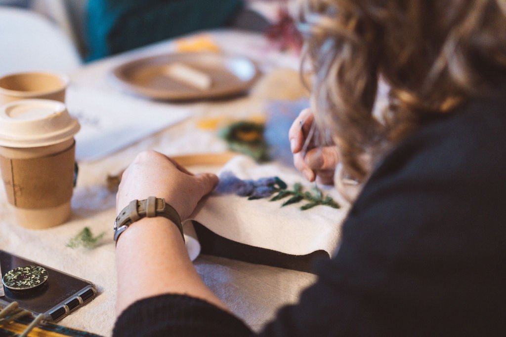
Our first gathering of the new year was held on Sunday, February 4th at the beautiful and historic Quaker meetinghouse in downtown York, Pennsylvania. Our workshop this season was botanical needlefelting led by Debbie Mancuso from Teaching Museum for the Fiber Arts and Textiles in Felton. As always, we enjoyed a spread of seasonal snacks and drinks and our cherished Sharing Table tradition. Read on for a complete recap!
Winter has held a different kind of magic for me in the years since I started prioritizing slow and seasonal living. The simple act of observing the changing seasons really helps me to feel more present and grounded. It’s the small, precious things, like the feeling of inhaling my first breath of frosty air as I step outside each morning…
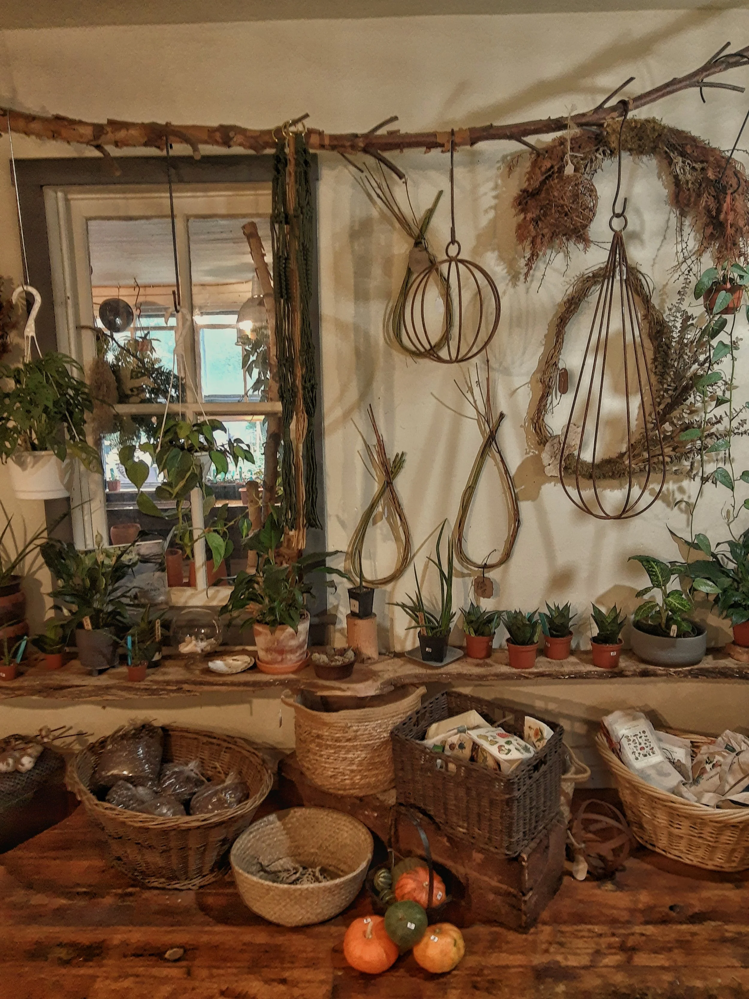
I first met Jennifer Lubman after CQC’ers Sharon and Mel told me about her adorable garden shop in Shrewsbury. Jenn's eye for design is evident in the evolving, seasonal displays she curates for the store, featuring unusual plants, preserved florals, and all manner of garden-inspired home and gift items. It’s like having our own miniature Terrain, here in York County!
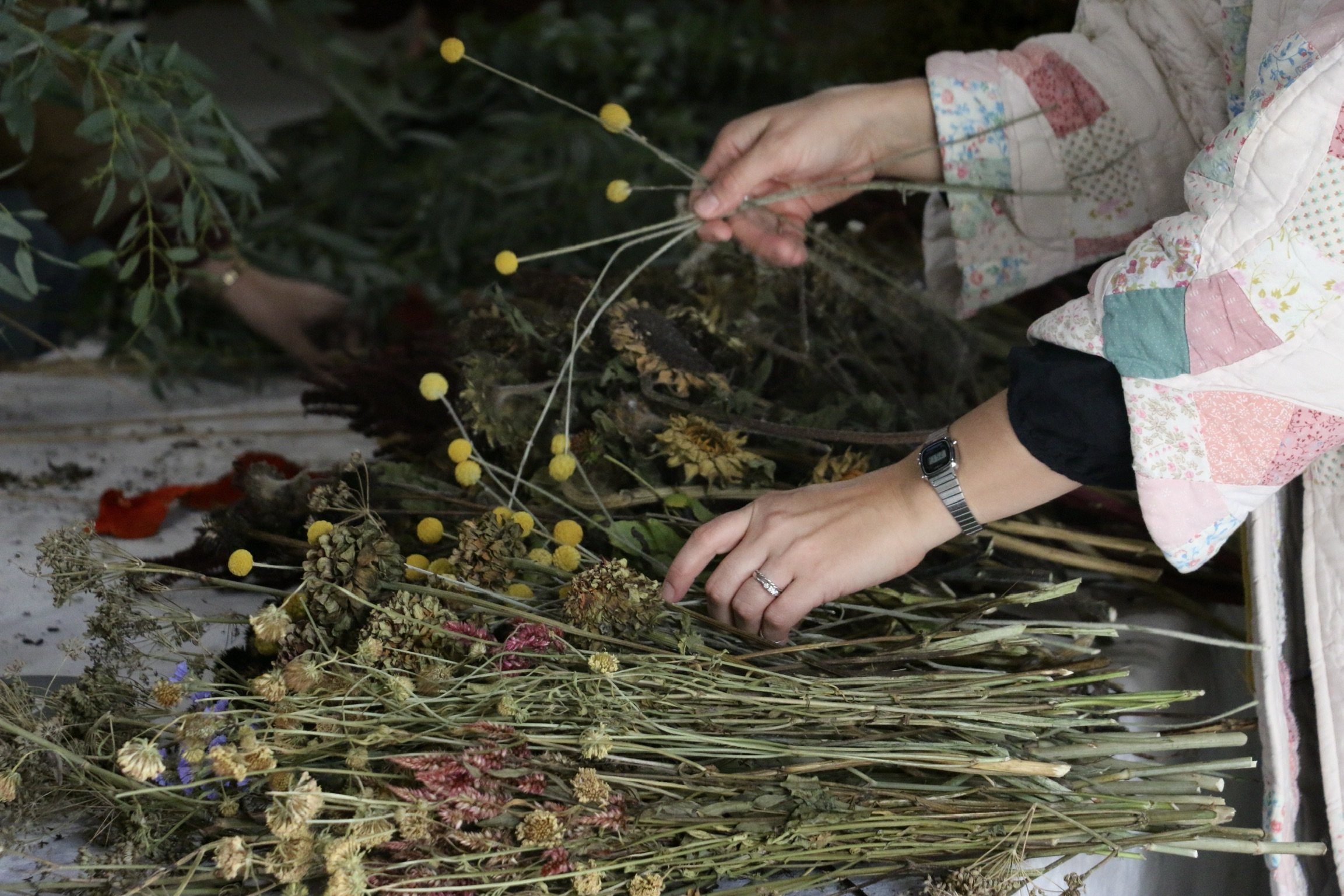
Our fourth and final 2023 gathering was held on Sunday, October 15th, at our favorite park pavilion in Yoe, Pennsylvania. We met at 2 pm and enjoyed a lovely fall afternoon with a dried wreath workshop led by Jennifer Lubman of Muhly & Cedar, followed by charcuterie, hot apple cider, and the sharing table. Read on for the complete recap!
On a Friday evening in late-September, we had our last Garden Walk at Little Farm Flowers East for the year. The garden was showing off its beautiful autumn colors and textures. The weather was perfectly crisp but not too chilly. The firepit was roaring and the s’mores and herbal sodas were delicious.
Sharon and I weren’t originally intending to have a garden walk this month, but we decided to offer one as a make-up rain date for those who couldn’t make it last time due to the crazy weather. I’m so glad we did! This time we started a little bit earlier to make time for extended introductions
Five years ago, we decorated this nursery for our first daughter. Now, we are getting ready to turn it into a “big girl room” for our second. Before the crib goes up to the attic for storage and we officially bid farewell to the baby years, I wanted to capture this moment in time.
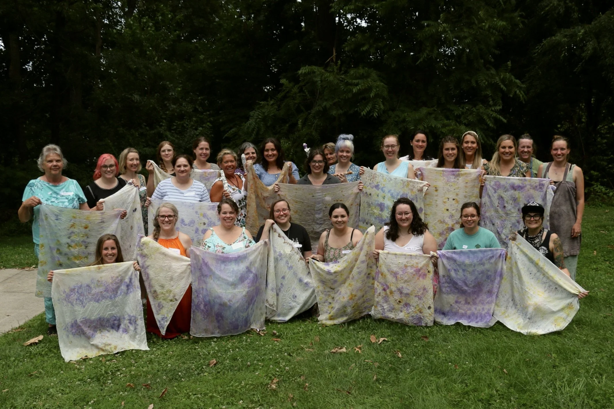
Our third gathering of 2023 was held on Sunday, August 6th at our favorite park pavilion in Yoe, Pennsylvania. We met at 4 pm and enjoyed a beautiful midsummer evening with our botanical eco-printing workshop, first harvest dinner, and a garden bounty share. Read on for the full recap!
Nestled into the rolling hills of eastern York County, Pennsyvlania is Flying Fibers Wood & Lavender Farm owned and operated by Jeri Robinson-Lawrence and Irina Lawrence-Mathias. Jeri and Irina are a vibrant and hardworking mother-daughter duo, on the farm and in their business.
This summer, we’ve started something new for Cross Quarter Club: Garden Walks at Little Farm Flowers East. Our first one was held this past Friday and it turned out to be such a lovely, relaxing evening!
Eco-printing is a great way to get started with the world natural dyeing. Using plant materials, such as whole flowers, flower petals, leaves, vegetables and nuts, you can easily create beautiful botanical printed fabric at home.
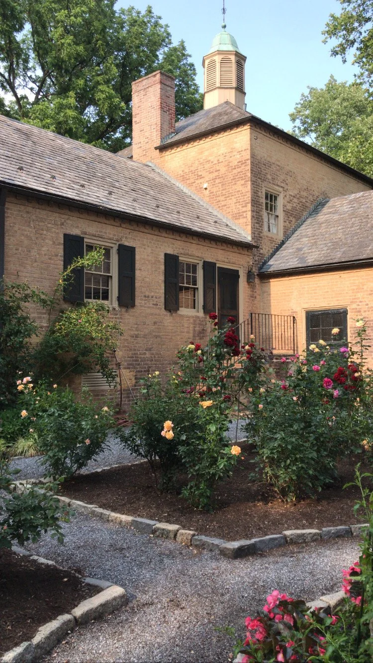
Last night, a few of us from Cross Quarter Club took a field trip to Conestoga House & Gardens in Lancaster, Pennsylvania and I loved every minute. Wandering the picturesque grounds together felt a little like being transported to Europe for an evening…
Our second gathering of 2023 was held on Sunday, May 7th at our favorite park pavilion in Yoe, Pennsylvania. We had the best afternoon filled with locally grown flowers, good conversation, a full spread of seasonally-inspired snacks, hot tea and dessert, and the first ever CQC Member Demonstration by Little Farm Flowers East.
When you are first getting into foraging, a common recommendation for trying new-to-you edible plants is to make a pesto out of it! I certainly didn’t invent this concept, but I had fun coming up with a flavor combination using wild plants readily available during spring in my bioregion.
The sharing table has been a part of every Cross Quarter Club gathering since the start. It’s an idea that fits within our club values, but the inspiration actually came from my grandmother. Today, I’m sharing the story behind the sharing table and why it’s so meaningful t to me.
Over the past year, I’ve gotten to know Sharon as both as a flower farmer and as a real kindred spirit through Cross Quarter Club. Sharon is one of the most kind-hearted people I know and I thought it was high time to put her and her beautiful flower farm in the spotlight!
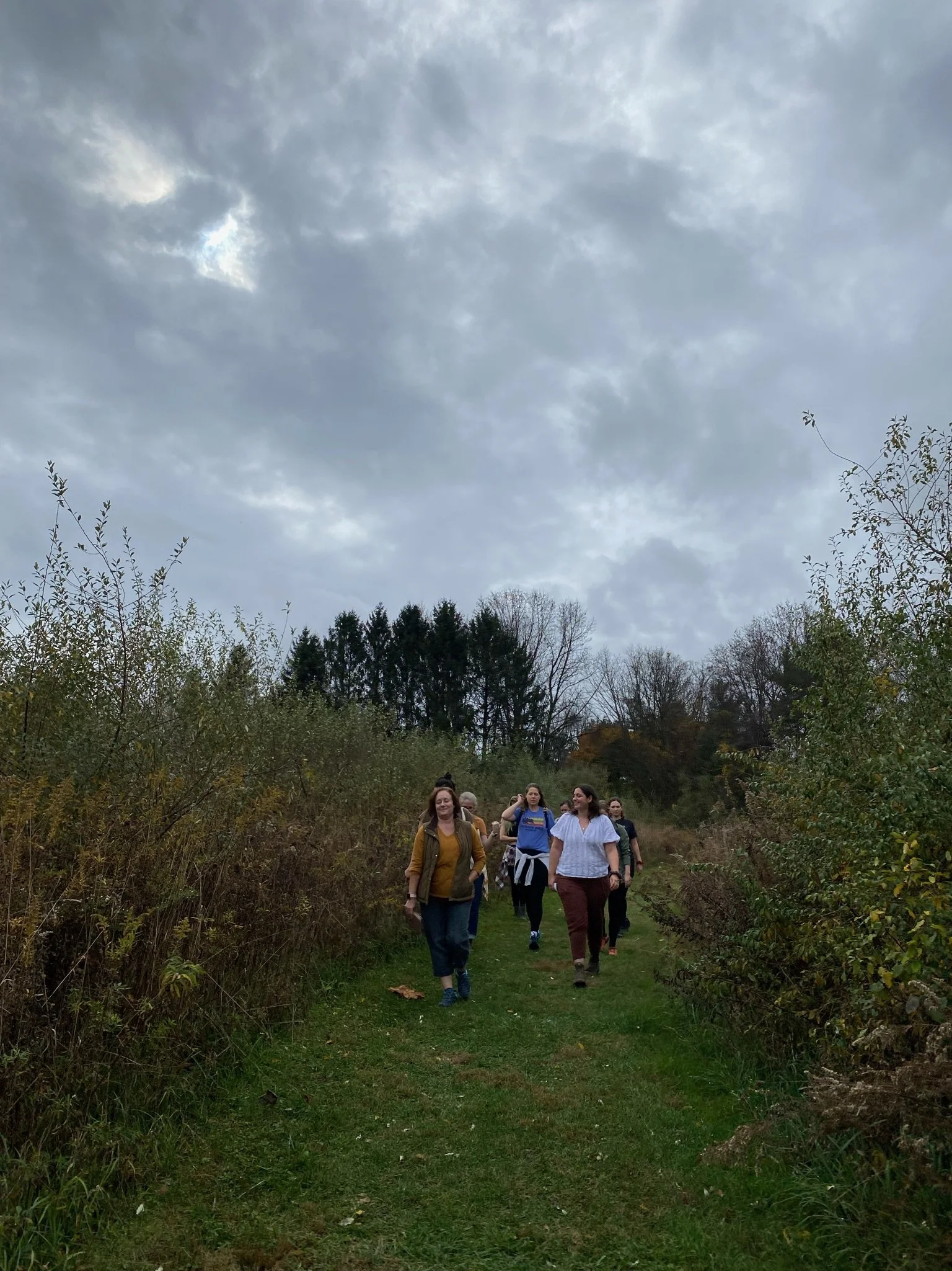
Our fourth and final gathering of 2022 was held on Sunday, November 6th at Nixon Park and Nature Center in York, PA. This time we met just after noon for a group hike and 10 minute mindfulness break, then cozied up inside
One of the strongest desires that emerged for me out of the early years of the pandemic was the desire for more real, in-person connection and community. This was my motivation for founding my Cross Quarter Club in the winter of 2022. We have all heard the saying…
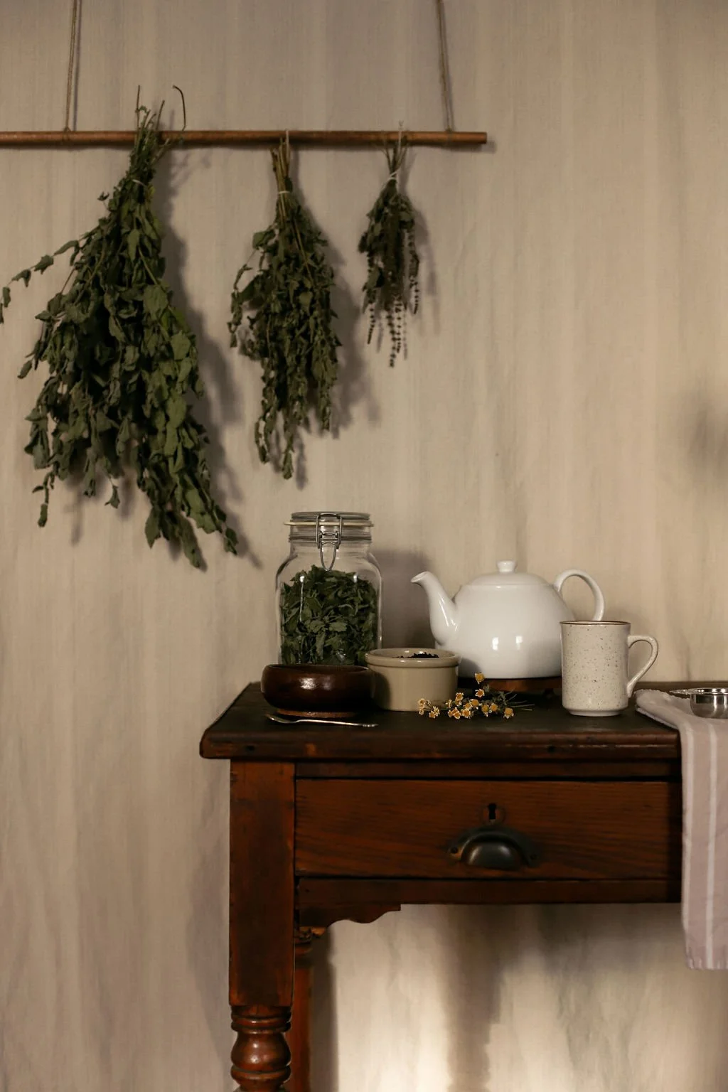
There is something about the ritual of making a cup of tea that transcends space and time. For thousands of years and all over the world, people have been combining leaves and hot water to create simple beverages that are deeply nourishing to both the body and soul.
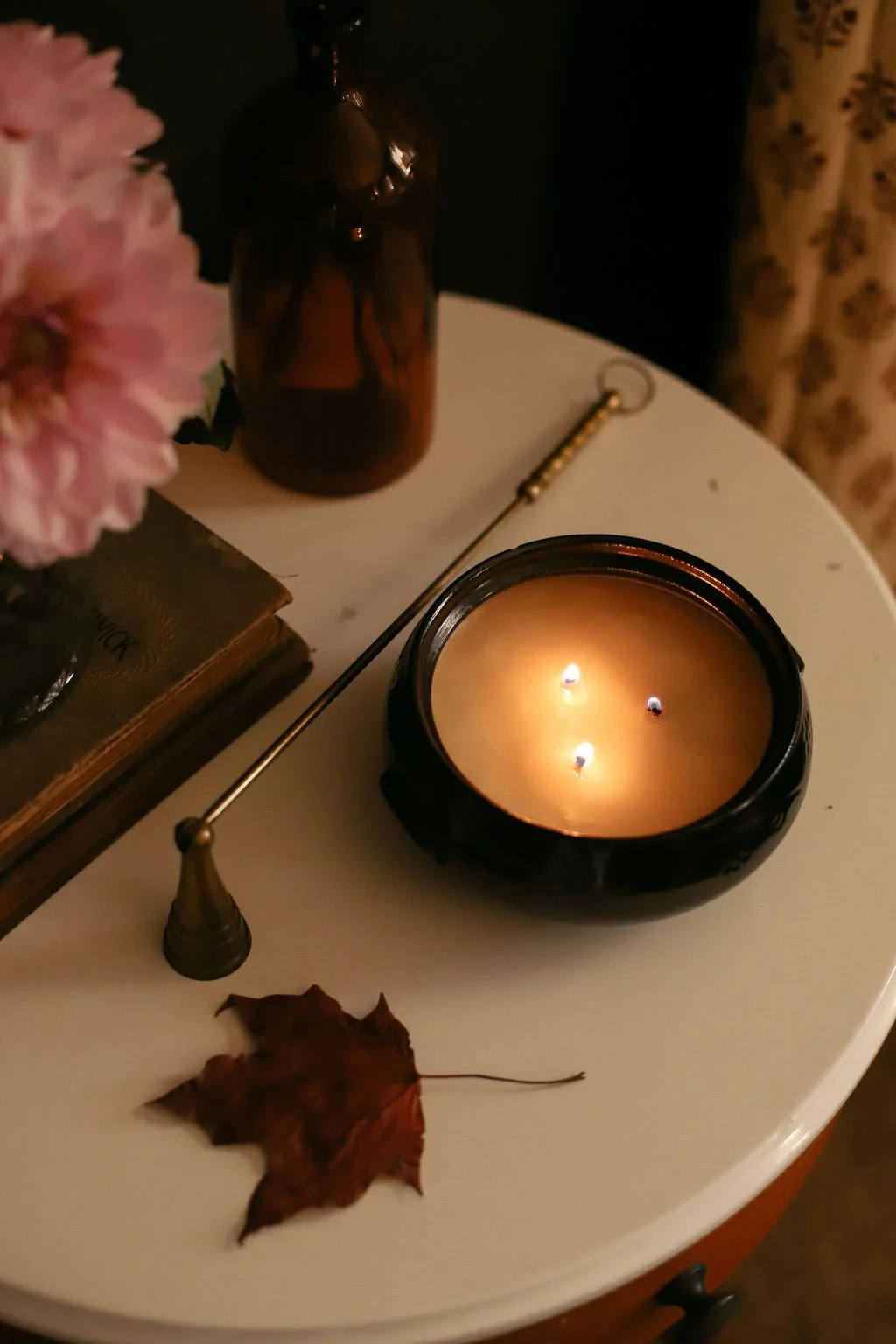
I tend to let mostly burned candles collect dust in a cabinet because it just feels too wasteful to throw them away, especially if they are in a beautiful vessel that could be reused or repurposed. I recently tested
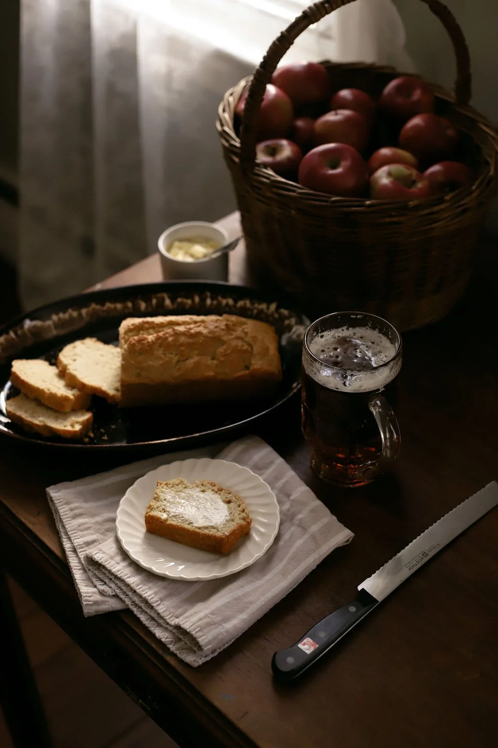
I’ve tried baking all different kinds of breads over the years, but the recipe I return to again and again is this simple and easy beer bread. It’s a one-bowl, quick bread recipe that requires no yeast or kneading and just 5 ingredients that you probably have in your pantry already.


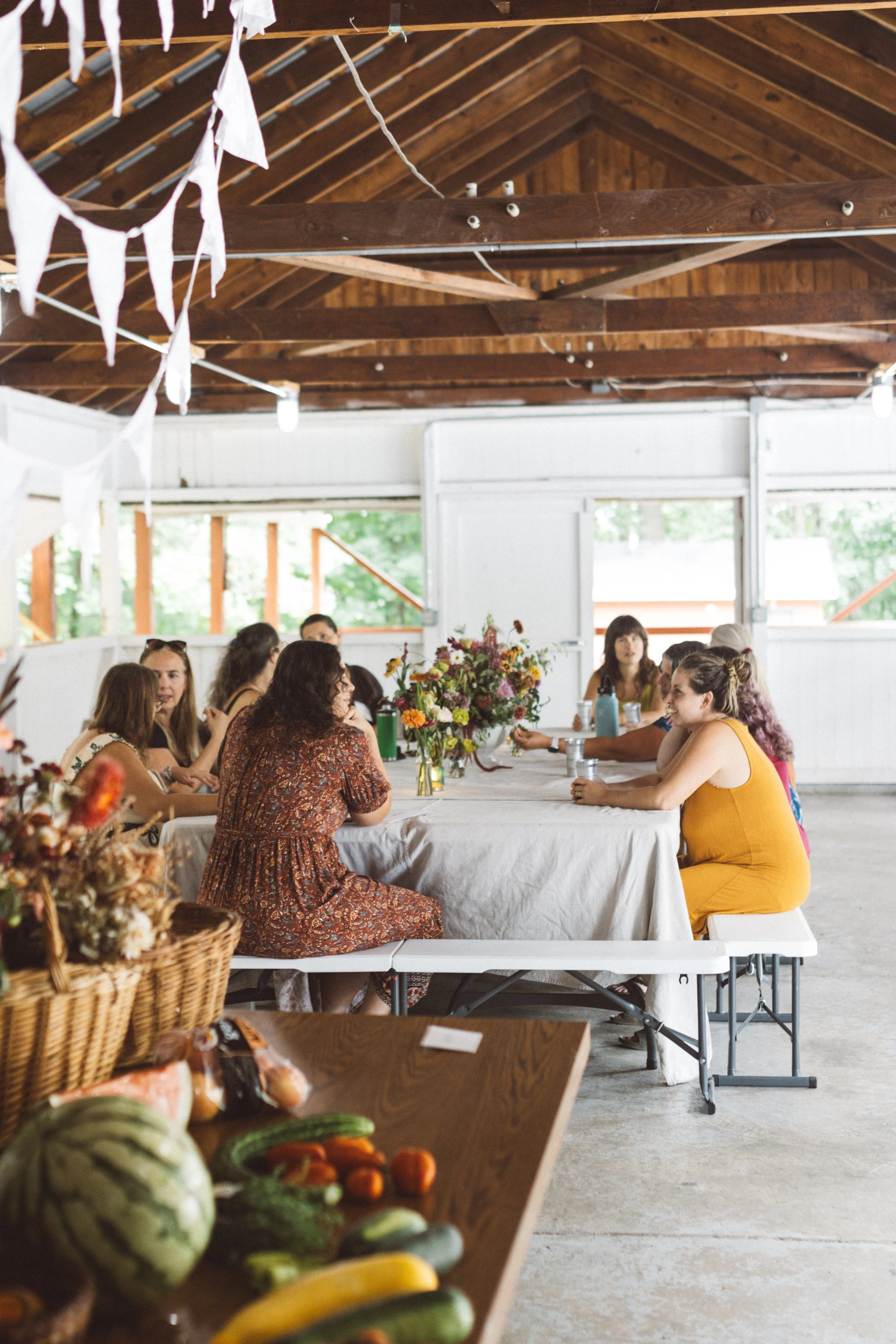








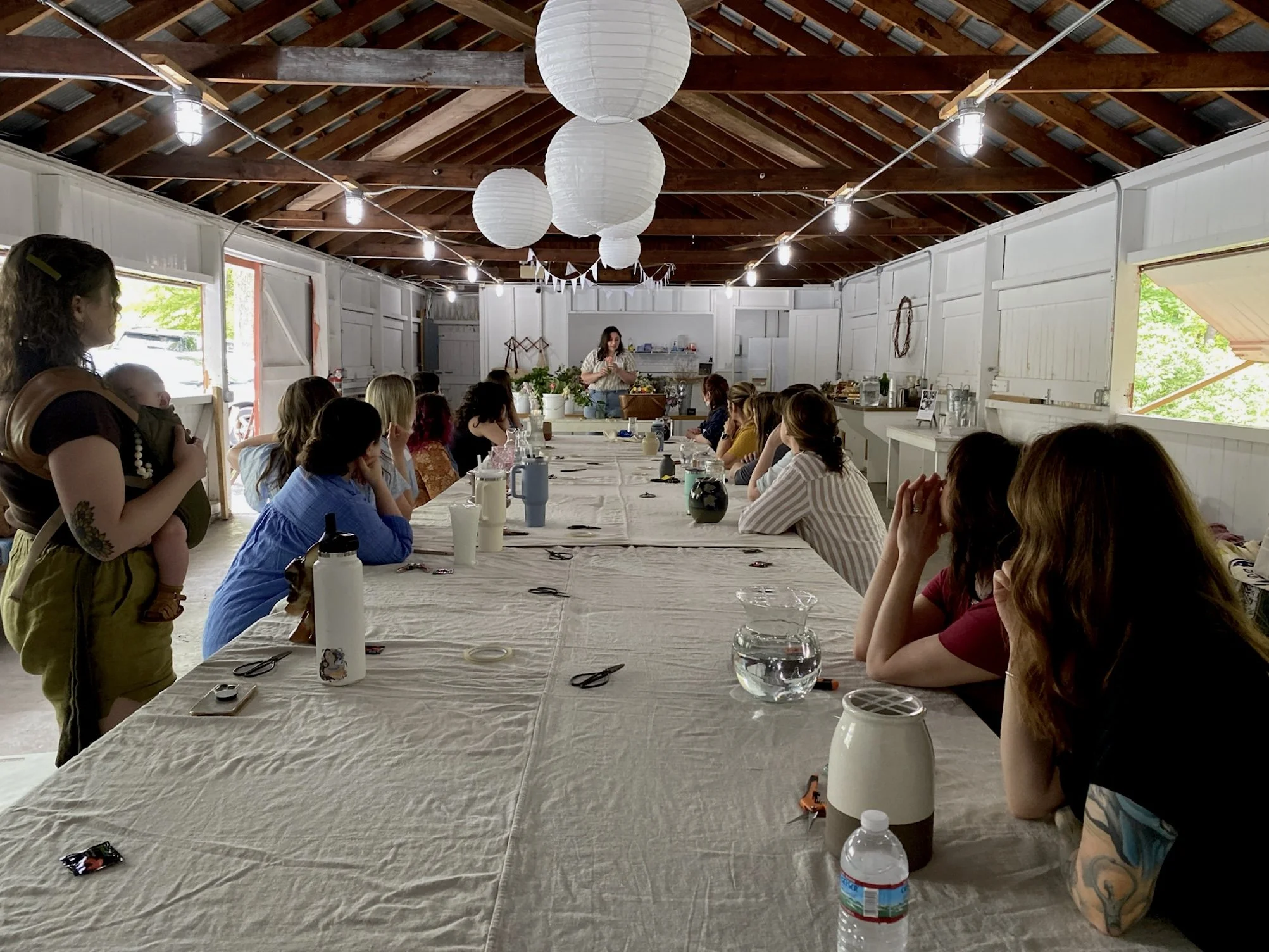


Our fourth gatherin of 2024 was held on Sunday, November 3rd at the pavilion at Yoe Park in Yoe Borough, Pennsylvania. This season, we poured our own soy candles into vintage vessels with instruction from Lindsey Dohm from This Little Light of Mine, LLC.